2.5 is live!
With the new features, we’re building on DramaQueen’s strengths so you can plan, develop and tell your stories even better.
We have also improved the DramaQueen interface, optimized the terms of several panels and made lots of small enhancements.
What are the new features?
- Structuring without limits
- Use established structure templates
- Create your own structure templates yourself
- New way of visualizing storylines in the navigator
- Colored highlighting of the lines in the navigator
- Two new turning-points: Pinch-point 1 & 2
Create custom structure templates for PRO
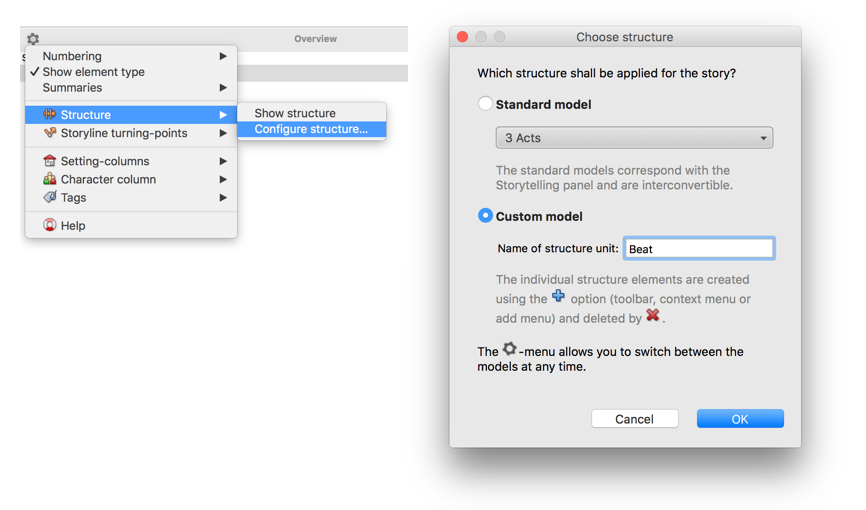
If you want to structure your story precisely with specific structure templates such as the Heroes Journey, “Save the Cat” or John Truby, you can now create these templates in DramaQueen PRO, modify them according to your own needs and save them:
There is a new option for freely configuring the structure:
- free description of the structure unit
- any number of structure elements that can be flexibly added or deleted
- individual name for each structure element
- optional numbering
- import structure templates from other dq documents
This means that the structure can be adapted individually for every story!
New visualization of storylines in the navigator for PLUS & PRO
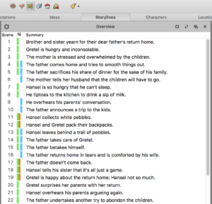
In the navigator, the storylines are now displayed as color bars (instead of colored circles):
Thus the storylines are generally more noticeable. In particular, it is easier to recognize when a storyline is interrupted.
Colored highlighting of the lines in the navigator for PLUS & PRO
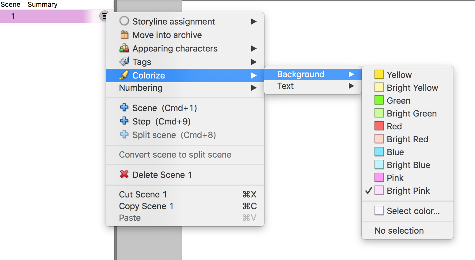
The lines of the navigator can be emphasized by color via the sub-menu Colorize which is located in the Edit menu as well as in the context menu of every element. Both the text and the background can be colorized:
This allows the navigator to be structured by color. While the color bars serve to display the storylines, you can use the colored lines completely freely, for example to highlight different narrative perspectives, locations, motifs, revised scenes or structure elements.
New terms
- The Outline panel became the Overview panel.
- The panel Dramatic Chart has been renamed to Story Arcs.
- The first text level is now called Plot (instead of Synopsis). And the second text level is called Outline (instead of Treatment). That makes their purpose as working texts more clear.
The Plot can now – depending on the usage – be divided into steps, parts, sequences, beats or stations:
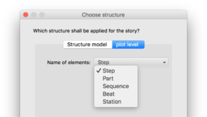
As a writer, you can decide whether you understand the terms ‘step‘, ‘beat‘ or ‘sequence‘ as action elements or as structure elements. For example you can use ‘step’ either as ‘action step’ or as ‘story step’.
Two new turning-points for PLUS & PRO
- The first pinch-point divides the first half of act 2 and is situated at about 3/8ths of the story.
- The second pinch-point divides the second half of act 2 and is situated at about 5/8ths of the story.
Overview summaries including turning-points and structure for PLUS & PRO
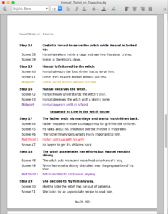
Generating the Overview summaries (via the menu ‘Extras’) will now also include any structure elements and turning-points.
New options in the Overview panel
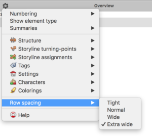
- The new setting ‘Row spacing’ allows to set the compactness of the rows to ‘Tight’, ‘Normal’, ‘Wide’ or ‘Extra wide’ (FREE, PLUS & PRO).
- Almost every configuration-option is also directly available in the drop-down of the respective toolbar-icon of the Overview panel. Furthermore there is a separate configuration for which types of elements (Steps/Parts respectively Scenes/Chapters) each property is displayed or deleted (PLUS & PRO):
All improvements can be found as always in our update report.
Enjoy trying out 2.5, we look forward to receiving your feedback!


No comments yet.